We’re eager to deliver the next important update of our HTML5 Gantt chart library. This time, our development team has put a lot of effort into making DHTMLX Gantt even smarter and more flexible in v6.3.
From now on, Gantt users may benefit from a new intelligent module for converting duration units from days to hours or minutes and back and specifying task duration in decimal format. Additionally, now our Gantt has an MS Project-like way of showing dependency links in the grid. We have also polished up scrolling the timescale, drag-n-drop of multiple tasks, and fullscreen mode. And that’s not all the new features and improvements in v6.3 – just keep on reading!
Download a free 30-day evaluation version of DHTMLX Gantt 6.3 now >
Intelligent Duration Formatting [PRO]
In the previous versions of DHTMLX Gantt users could set task durations in whole numbers only. Starting with v6.3, they can specify the duration in fractional numbers as well. Now there’s no difficulty in assigning tasks that are 2.5 hours or 0.5 days long. Moreover, now Gantt is capable of converting minutes into hours, hours into days, days into months, etc. and vice versa.
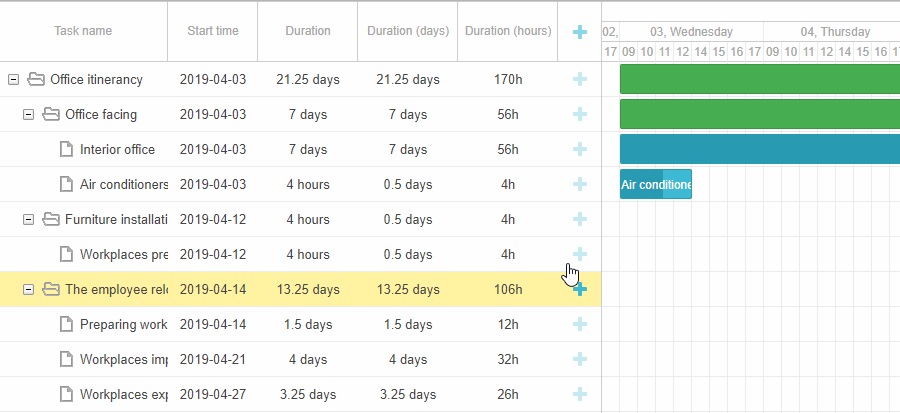
All that is possible due to a brand new Duration Formatter module, which is easy to set up.
Firstly, if you’d like to specify task duration in fractions of an hour precision (for example, set the duration to 0.5 hours), you’ll need to store the duration of tasks in minutes:
Storing duration in hours will do as well and may be even better for the overall performance of the Gantt chart:
When you are done with that, just create the formatter object as described below and add it to the Duration column of the grid, lightbox, and inline editors if necessary:
var formatter = gantt.ext.formatters.durationFormatter({
enter: "day",
store: "minute", // duration_unit
format: "day",
hoursPerDay: 8,
hoursPerWeek: 40,
daysPerMonth: 30
});
{name: "text", tree: true, width: 170, resize: true, editor: textEditor},
{name: "start_date", align: "center", resize: true, editor: dateEditor},
{name: "duration", label:"Duration", resize: true, align: "center",
template: function(task) {
return formatter.format(task.duration);
}, width: 100},
{name: "add", width: 44}
];
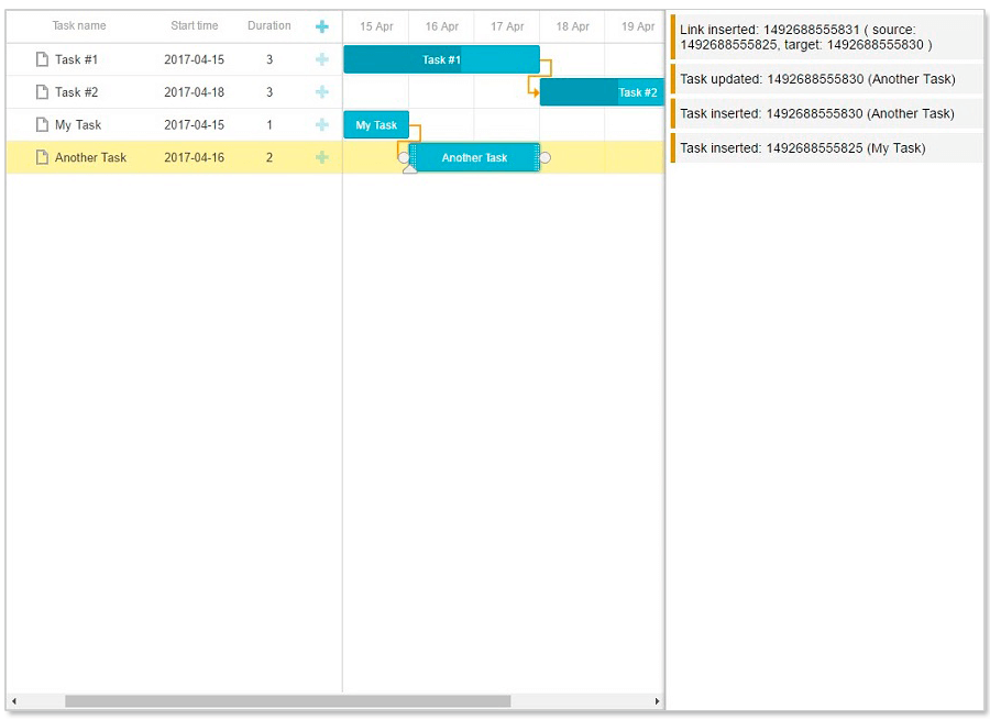
MS Project-Like Link Formatting [PRO]
In v6.3 DHTMLX Gantt provides an alternative way of linking tasks with each other via inline editors in the grid. It is based on MS Project formats of task dependencies:
- finish_to_finish: “FF”
- finish_to_start: “FS”
- start_to_start: “SS”
- start_to_finish: “SF”
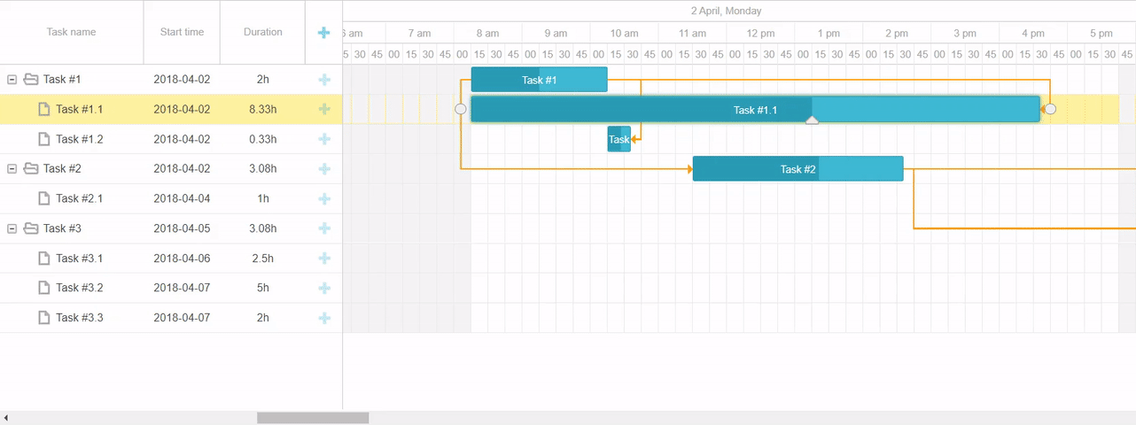
Now end users can fill in cells of the grid with inline editors responsible for linking tasks by typing in abbreviations common for MS Project. For example, “2FF+1 day” abbreviation means that one of the tasks should be finished not later than one day after the end of the second task. Such link formatting can be enabled via the Link Formatter module. Read more in the documentation >
 Check the sample >
Scrolling the Timeline with the Mouse
Working with huge Gantt charts is more convenient now, as end users can quickly scroll the timeline using mouse click and drag:
 Check the sample >
This ability can be implemented with the help of the dhtmlxgantt_drag_timeline extension:
The properties of the drag_timeline object allow you to control the behavior of Gantt elements while scrolling the timeline. The useKey property enables scrolling only when you press the specified key like Ctrl, Shift, Alt, etc. Besides, you can define which Gantt elements shouldn’t be affected in the process of scrolling by adding their CSS classes to the ignore property:
ignore:".gantt_task_line, .gantt_task_link",
useKey: false
};
Additionally, we enlarged the API of horizontal scrolling in the timeline. Now developers can change the default Shift key to Alt or Meta keys in the horizontal_scroll_key property or even disable the horizontal scroll.
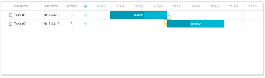
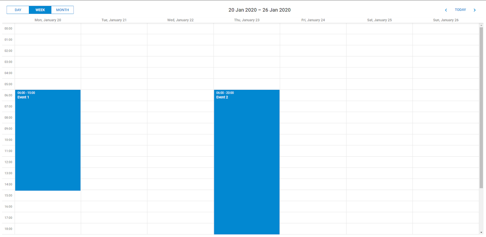
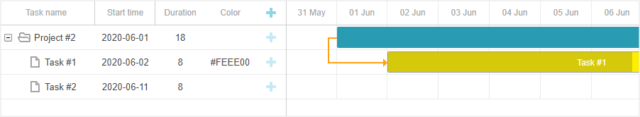
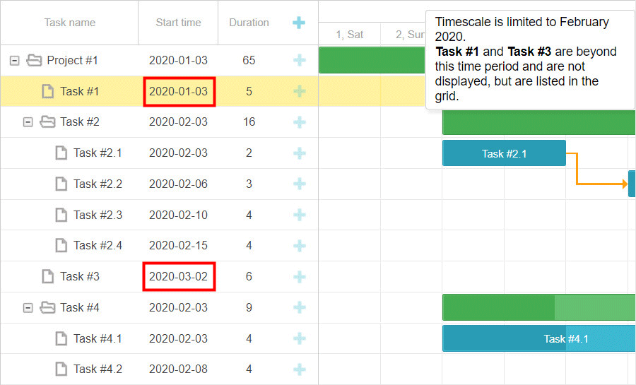
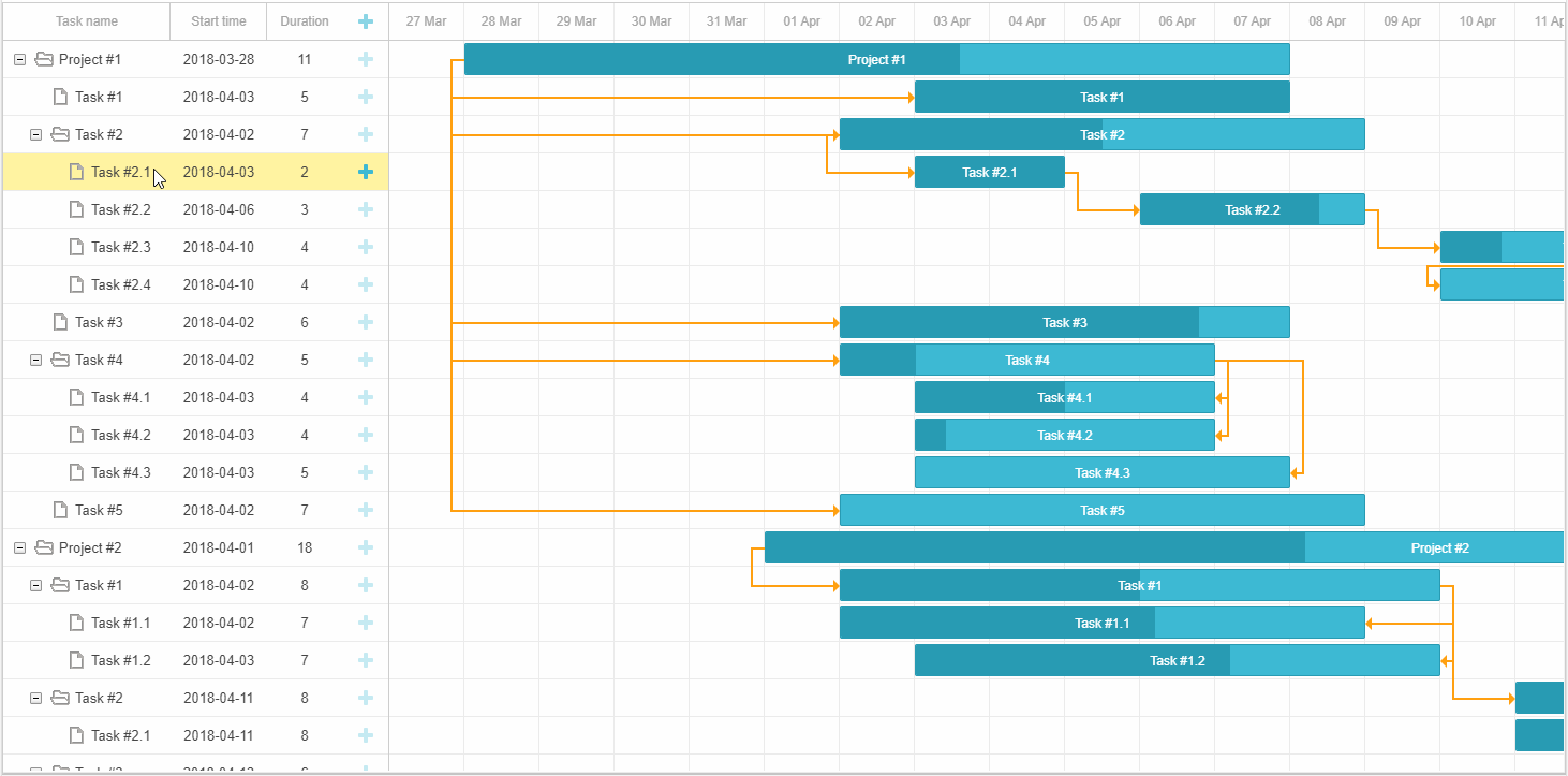
Displaying Tasks Outside of the Specified Time Range
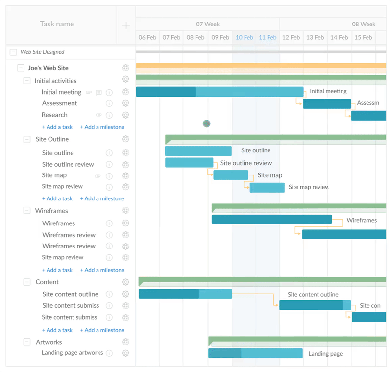
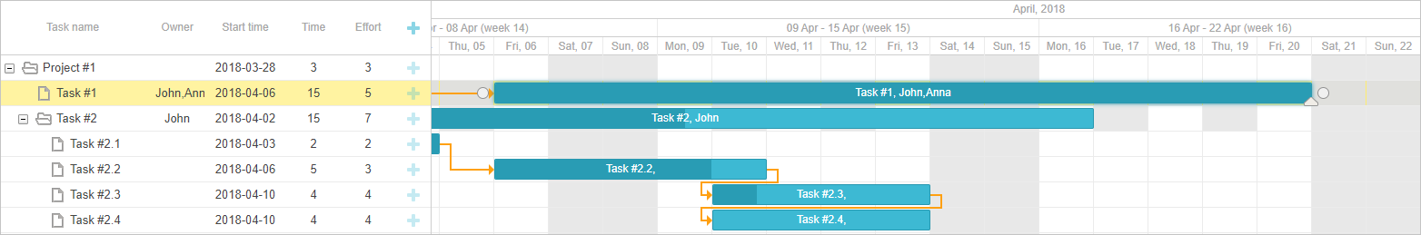
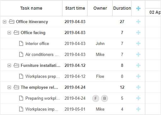
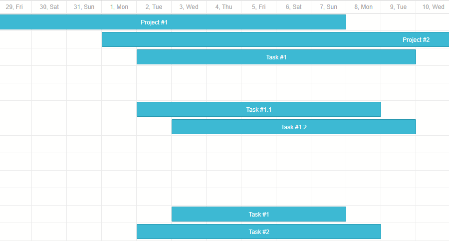
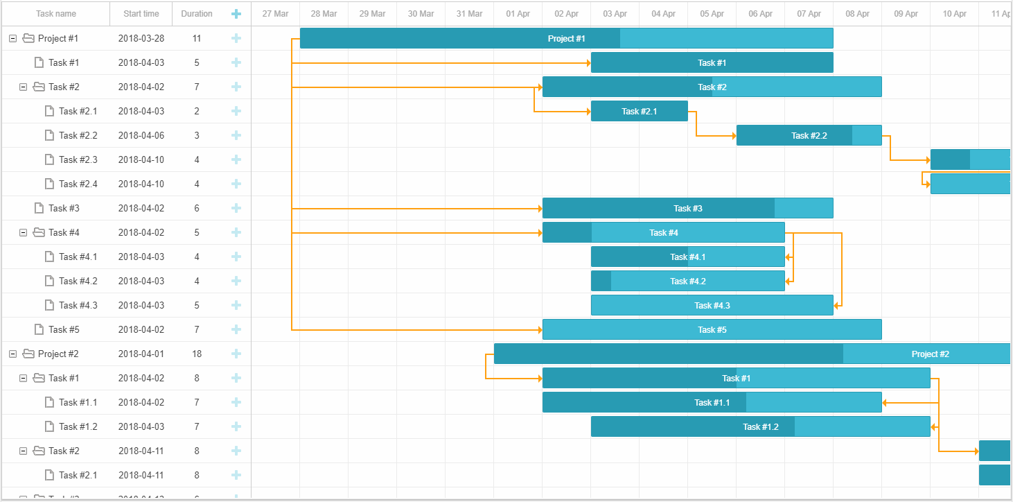
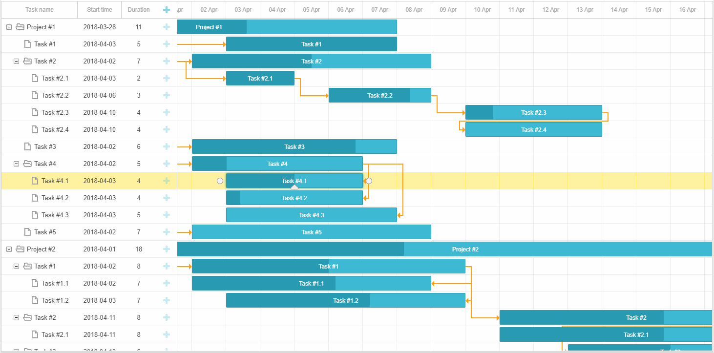
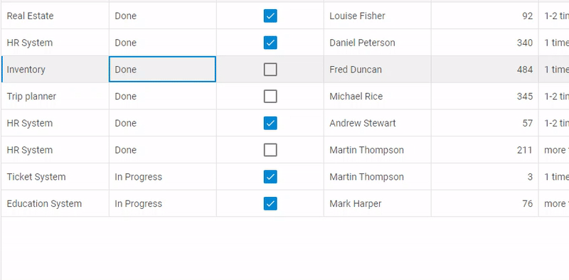
Previously, users faced a problem of not being able to see the tasks that were assigned on dates outside of the limited time range of the Gantt chart. V6.3 copes with this issue by showing such tasks in the grid, even if they start and end before or after the specified time period. For instance, in the project below tasks 1 and 3 take place in January and March respectively. These tasks are listed in the grid, while the chart displays only the tasks scheduled for February 2020. Learn more in the documentation >
 Check the sample >
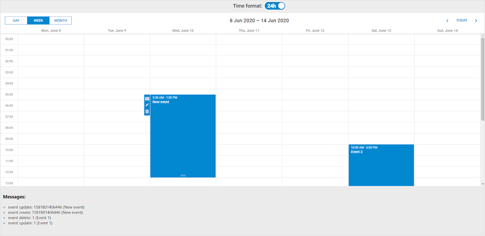
Drag-n-Drop of Multiple Tasks
Due to the ext/dhtmlxgantt_multiselect.js extension, it’s possible to select multiple tasks and manage them all together. In v6.3 the newly introduced drag_multiple method allows selecting several tasks by Shift or Ctrl-clicking and moving them simultaneously while saving their position in relation to each other:
The same approach can be applied to projects by using the drag_project method:
Other Important Updates
Smart Rendering Update
The release revamped the smart rendering techniques in order to further improve Gantt performance with large data sets. Now our updated Gantt chart is able to understand the exact position of custom elements such as baselines, deadlines, milestones, etc. and render them only when they are visible. It became possible due to the renderer configuration object, which keeps track of the visible area of the chart as well as the position of custom elements and decides whether to display them or not. Learn more in the documentation >
Full-Screen Mode
V6.3 brings out the ability to display not only the Gantt chart itself but also its header and other additional elements in the fullscreen mode.
How to Undo Custom Actions
Another essential update is the possibility to undo and redo changes you make to your Gantt from the code. Read more in the documentation >
Compatibility with RequireJS
V6.3 introduces some changes to the usage of RequireJS with DHTMLX Gantt. For more details, consult the migration article.
Inclusive End Dates in the Grid
In the previous versions, the grid column with the end date of tasks comprised exclusive dates. For example, the end date of the task starting on November 10 and lasting for 3 days would fall on November 14 in the grid. Whereas, the timeline displayed the duration of the task taking into account only inclusive dates (November 10-13). In order to avoid confusion and show inclusive dates everywhere, v6.3 offers a special template for redefining the format of end dates in the grid and lightbox.
We hope all the new features and updates will come in useful in your projects. We’re eager to get your feedback and continue further enriching the abilities of DHTMLX Gantt!
Please note that the features marked with PRO label are available under the Professional edition of paid licenses only.
We invite you to try out the latest version during a free 30-day evaluation.
Current clients may download dhtmlxGantt 6.3 in their Client’s Area.
Related Materials:
- Full “What’s New” list in the documentation
- DHTMLX Gantt Samples
- Migration from v6.2 to v6.3
The post DHTMLX Gantt Chart 6.3 with Decimal Durations, Link Formatting, Drag-n-Drop of Multiple Tasks, and Even Smarter Rendering appeared first on DHTMLX Blog.
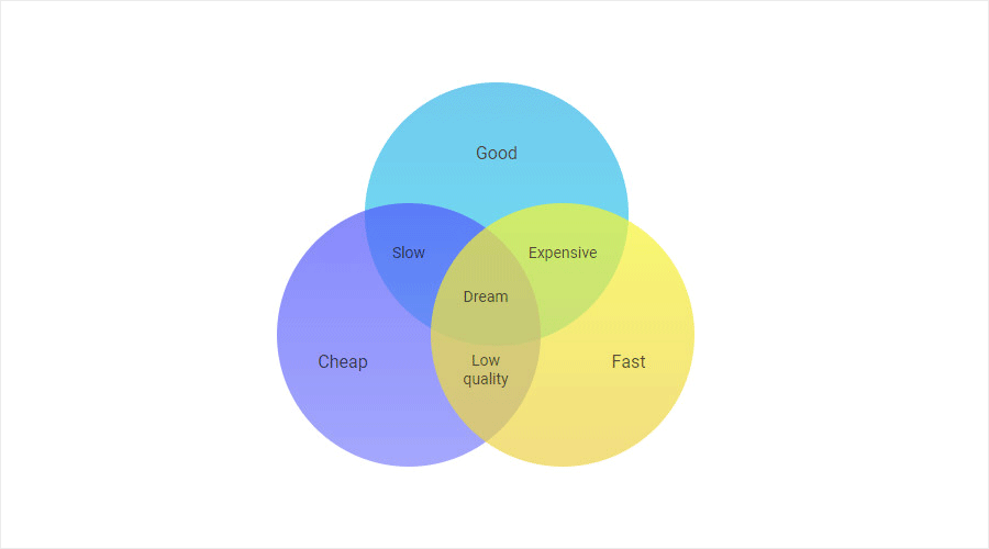 Venn diagrams are designed for finding patterns and defining logical relations among groups of objects, which are usually split into 3 sets. Overlapping areas stand for common characteristics of objects in question.
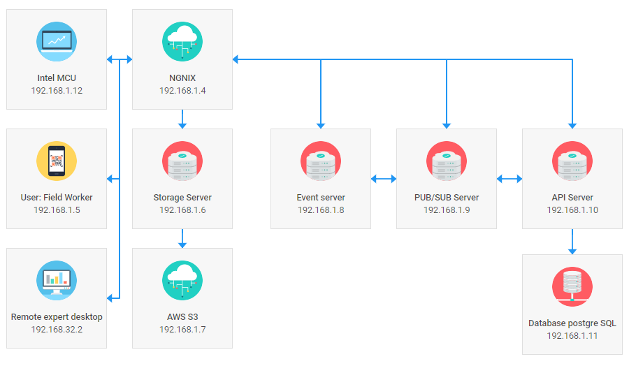
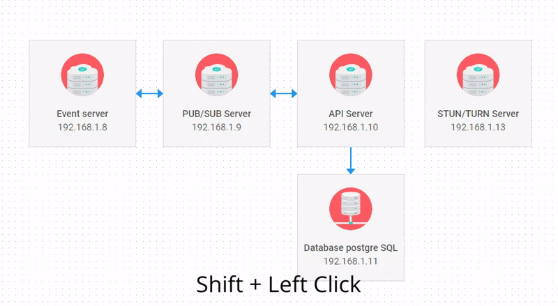
  Network diagrams usually depict the structure of telecommunication systems. Besides, they can be applied in project management for showing the process flow.
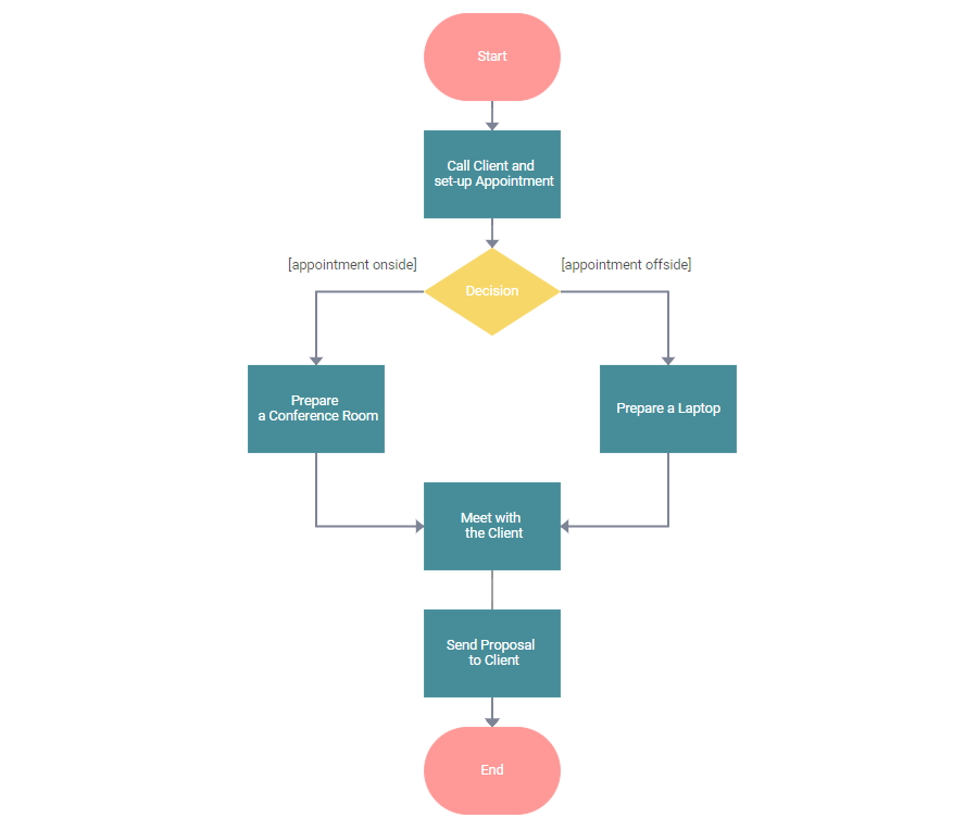
 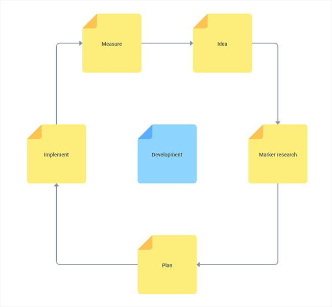 Life cycle diagrams make it easy to illustrate the stages of a product’s or project’s life cycle. In our example, the stages of the development process are designed with the help of yellow sticky notes.
 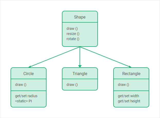 UML Class Diagram for software engineering. Check the samples with
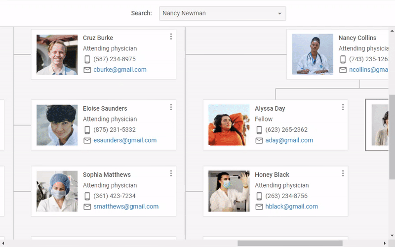
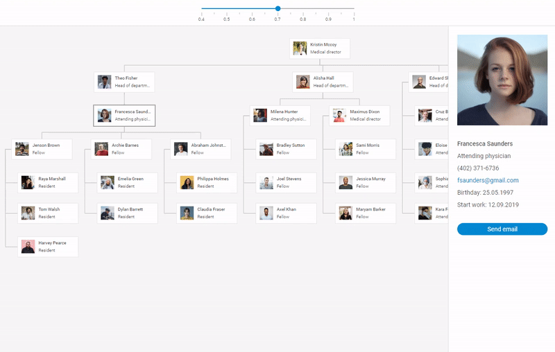
 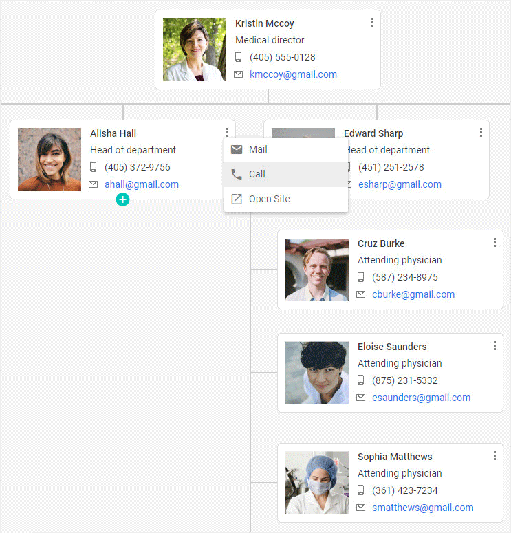 Hospital org chart illustrating medical hierachy.
 Uploader inside the Ribbon component.
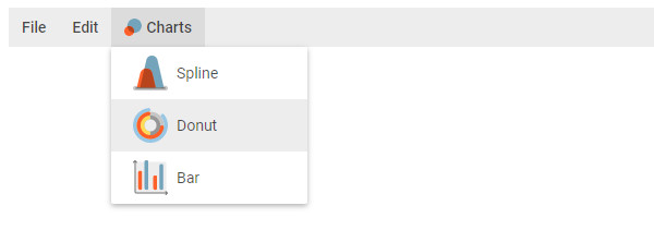 Menu items with custom icons.